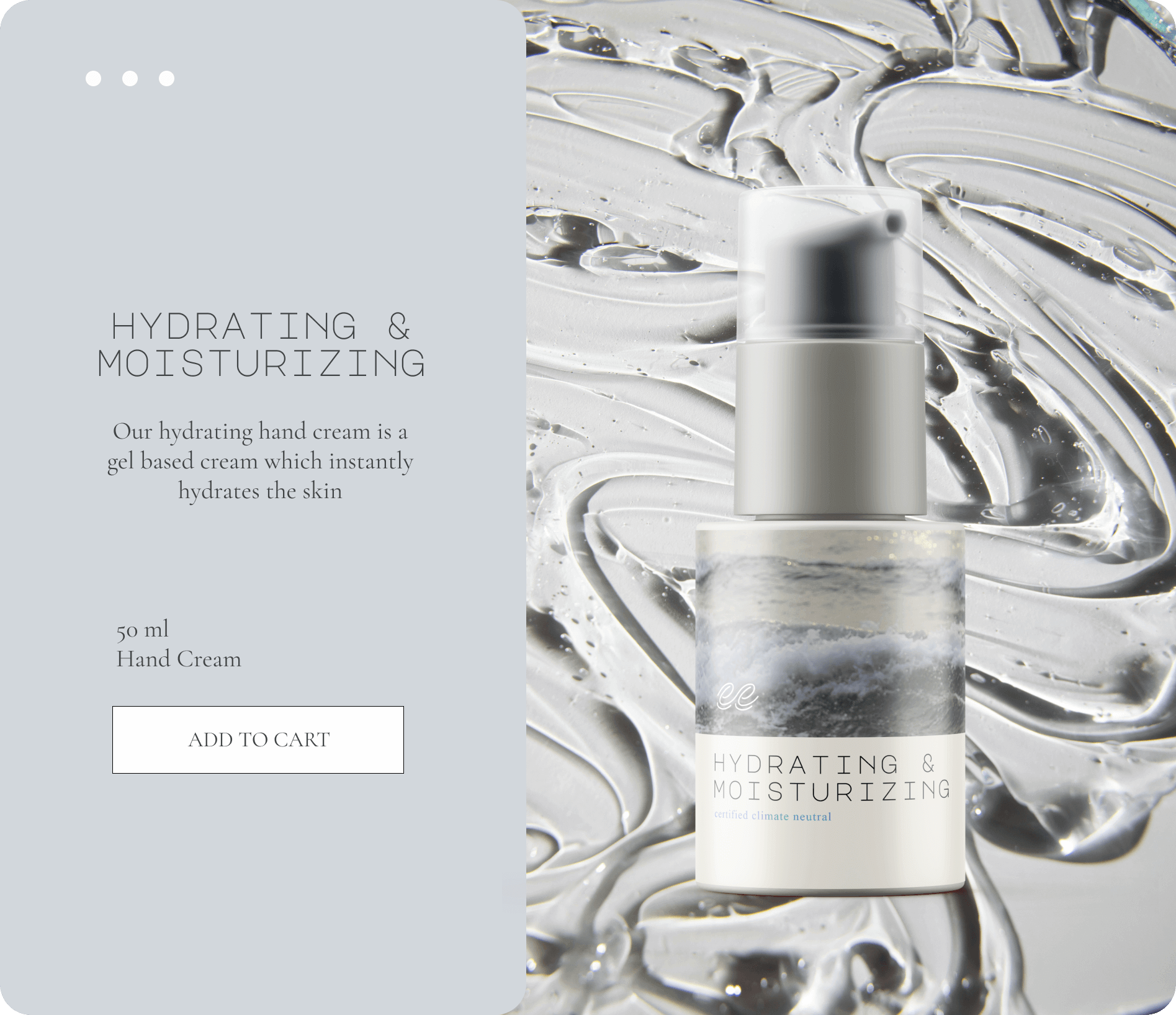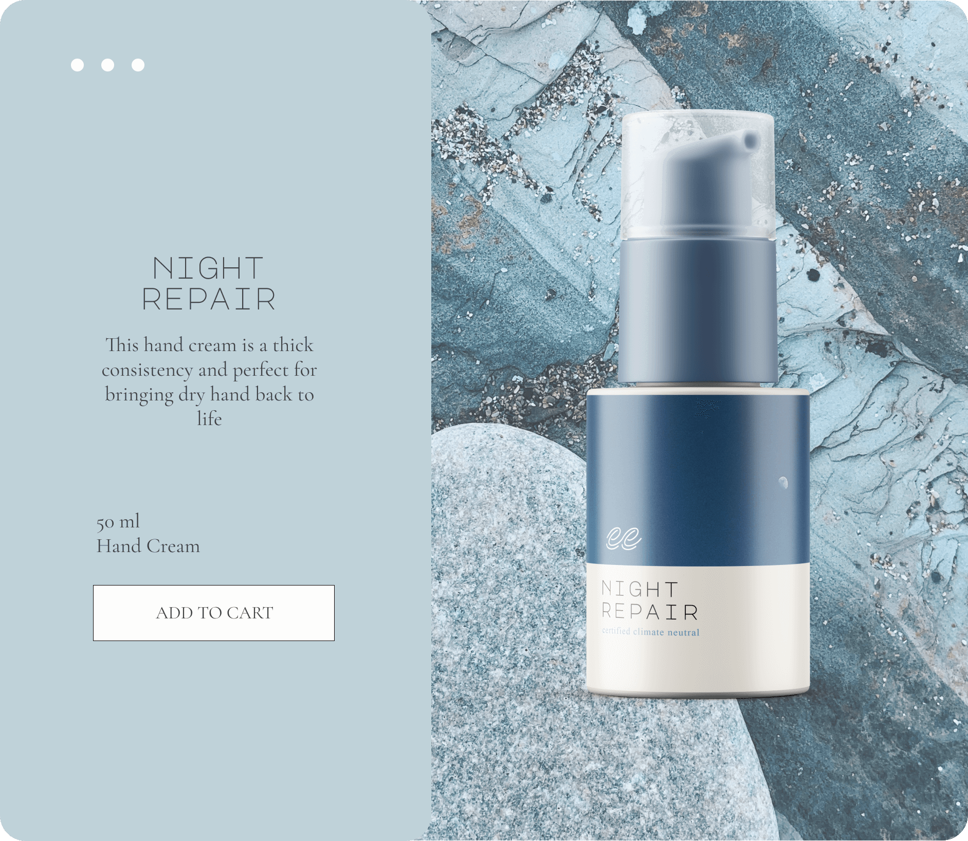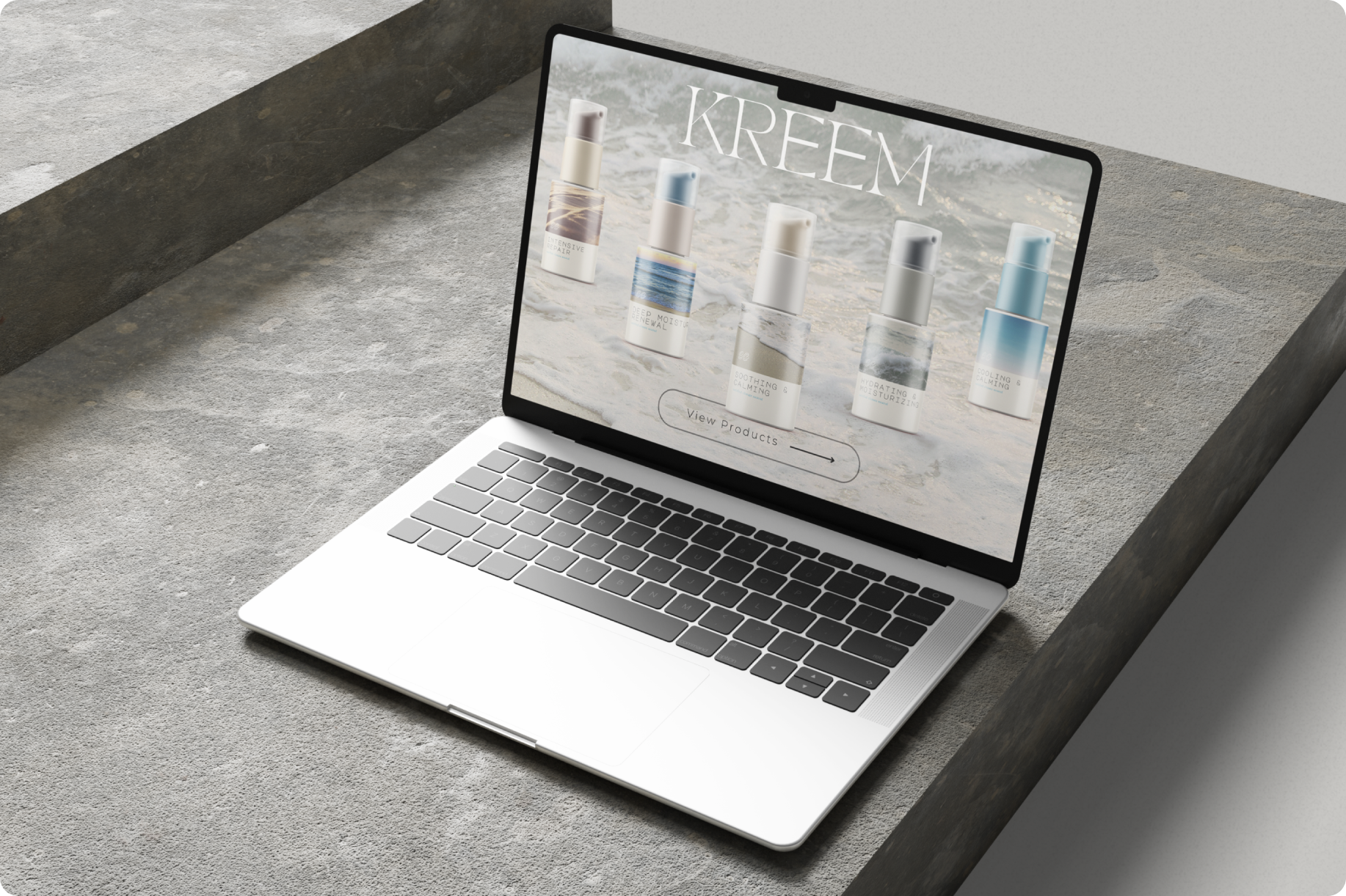
KREEM
Like the ocean's embrace, self care Heals the soul
ABOUT
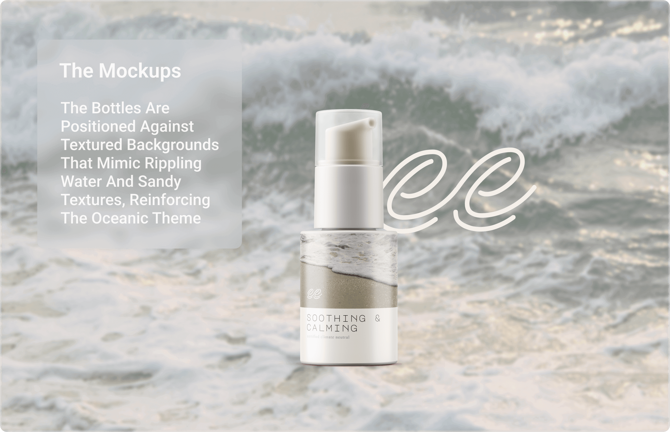
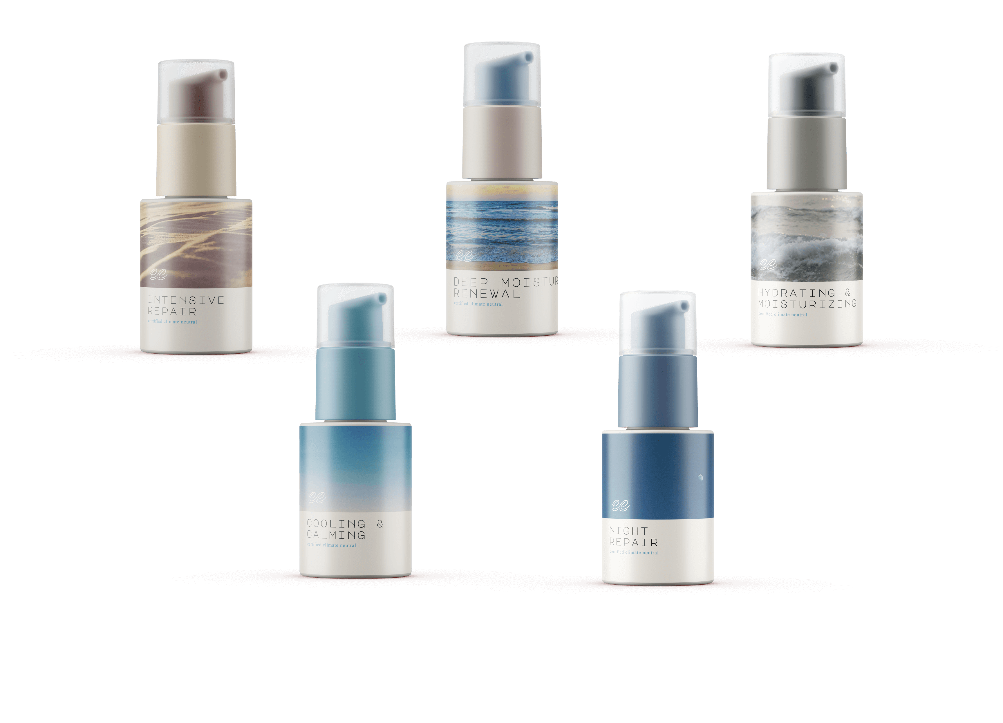
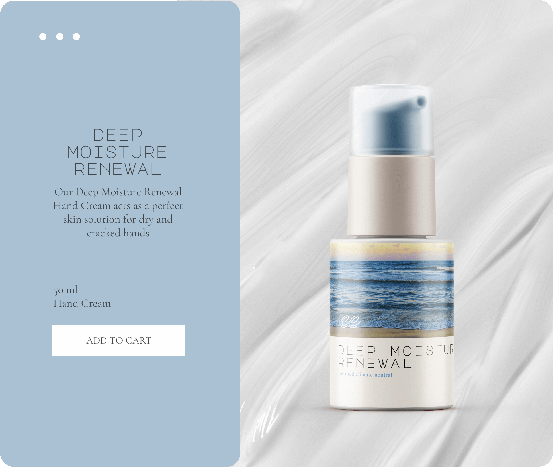
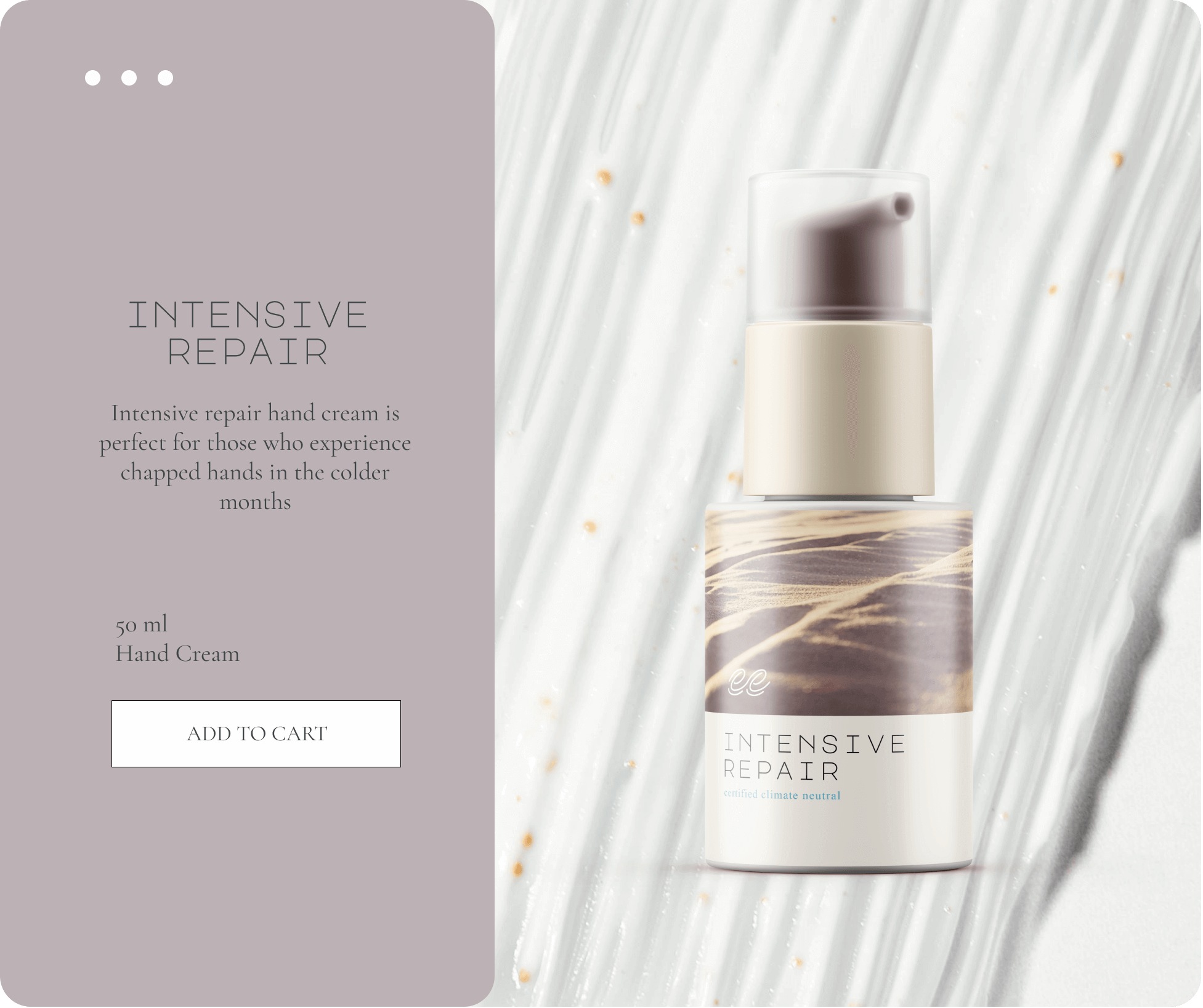
The KREEM project focused on developing a brand identity for a hand and body cream company. I created a style guide, product packaging design and promotional assets that capture the essence of coastal serenity and premium skincare.
ROLE
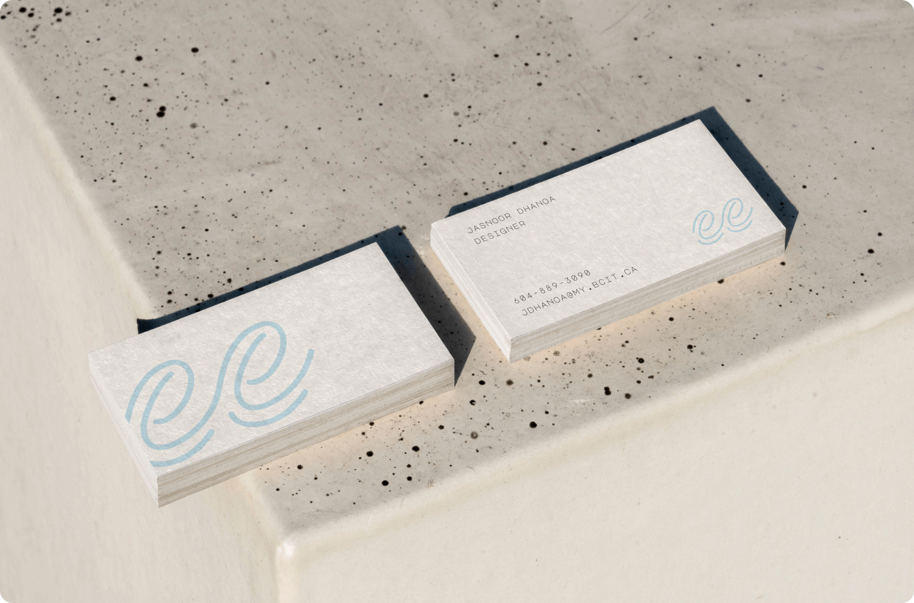
Designer
PROJECT DURATION
2 months